Vittorio Storaro and the Idea That Color Is a Language
The DP who spent a year reading Goethe, then proved across three Oscar-winning films that a room's color can carry its whole psychology.

Most of us treat color as a decision we make in the grade. Shoot it clean, protect the highlights, sort out the mood later with a colorist and a set of nodes. Vittorio Storaro never worked that way. For him the color was in the script before it was in the camera — a repressed man was blue because he was repressed, a room was amber because someone in it was about to give in.
That distinction is the whole story of Vittorio Storaro cinematography. He didn't light scenes so much as write them in color, treating each hue as a word with a fixed meaning he could return to across an entire film. It's a system, not an instinct, and it earned him three Academy Awards for Best Cinematography — a club that, among living DPs, he shares with only Robert Richardson and Emmanuel Lubezki.
The year he spent figuring out what color meant
The system didn't arrive fully formed. After finishing Apocalypse Now, Storaro effectively stopped and went to school on himself. He spent the better part of a year at home, reading and watching, trying to understand what was actually inside light and color rather than just what looked good on film. The reading that stuck was Goethe's Theory of Colours — a study less about optics than about the psychological weight each color carries, how blue pulls one way and red another before a viewer can name why.
Out of that came a personal philosophy he later published as a multi-volume set called Writing with Light, one book for light, one for color, one for the elements. The title isn't a flourish. Storaro genuinely thought of the cinematographer as a co-author writing in a visual language, and color was his vocabulary. Once you know that, his films stop looking like beautiful photography and start reading like sentences.
The Conformist: cold blue as a man hiding from himself
Go back to where it started with Bertolucci. The Conformist (1970) was their first film together, the beginning of a partnership that ran twenty-five years. The story is a study of a man so desperate to be normal, to disappear into fascism, that he betrays everyone around him — and Storaro shoots his world in cold blues and off-kilter golds that never quite feel warm.
The palette does the psychology the dialogue won't say out loud. Marcello moves through corridors and civic halls that dwarf him, lit in that expressionistic, noir-adjacent light that makes the past feel remembered rather than lived. It's alienation you can see. The look was influential enough that American directors — Coppola among them — took notes, and you can trace a straight line from those interiors to a good deal of prestige filmmaking that followed.
Apocalypse Now: saturation as the sound of losing your mind
By Apocalypse Now (1979), the vocabulary had teeth. Storaro pushed the color past realism on purpose, wanting the jungle world to tip into something surreal. The green of the jungle sits against the yellow-orange of napalm and fire, and the two aren't just pretty — the artificial, chemical color of war keeps intruding on the organic green, civilization burning its way upriver. Coppola handed him the visual look with almost no leash, and Storaro used that freedom to make the image itself feel feverish. It won him his first Oscar, and it's the film that sent him off to read Goethe in the first place.
The Last Emperor: a whole life told in color
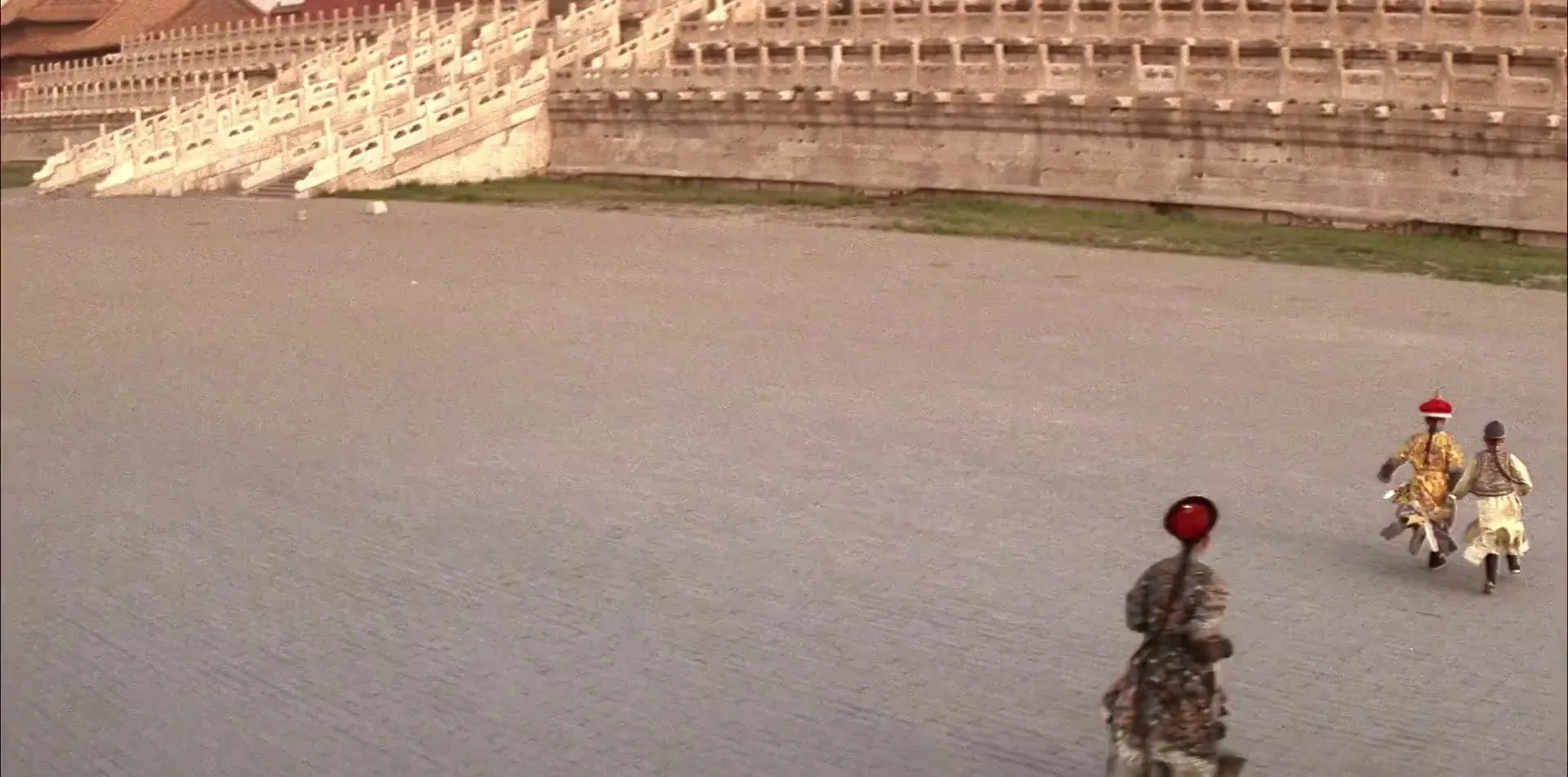
If you want the clearest proof of the theory, it's The Last Emperor (1987), which won Storaro his third Academy Award. He built the film's color around the arc of Pu Yi's life and structured it deliberately — the emperor, the puppet, the ordinary citizen — so the palette ages with the man.
The childhood inside the Forbidden City is drenched in warm reds and imperial yellows — yellow being the color of the sun, the divine, the empire itself. It's gorgeous, but it's also a trap: the warmth is the gilded cage. Storaro lets the heat of the color stand in for a world that is total, saturated, and completely sealed off from everything outside the walls.
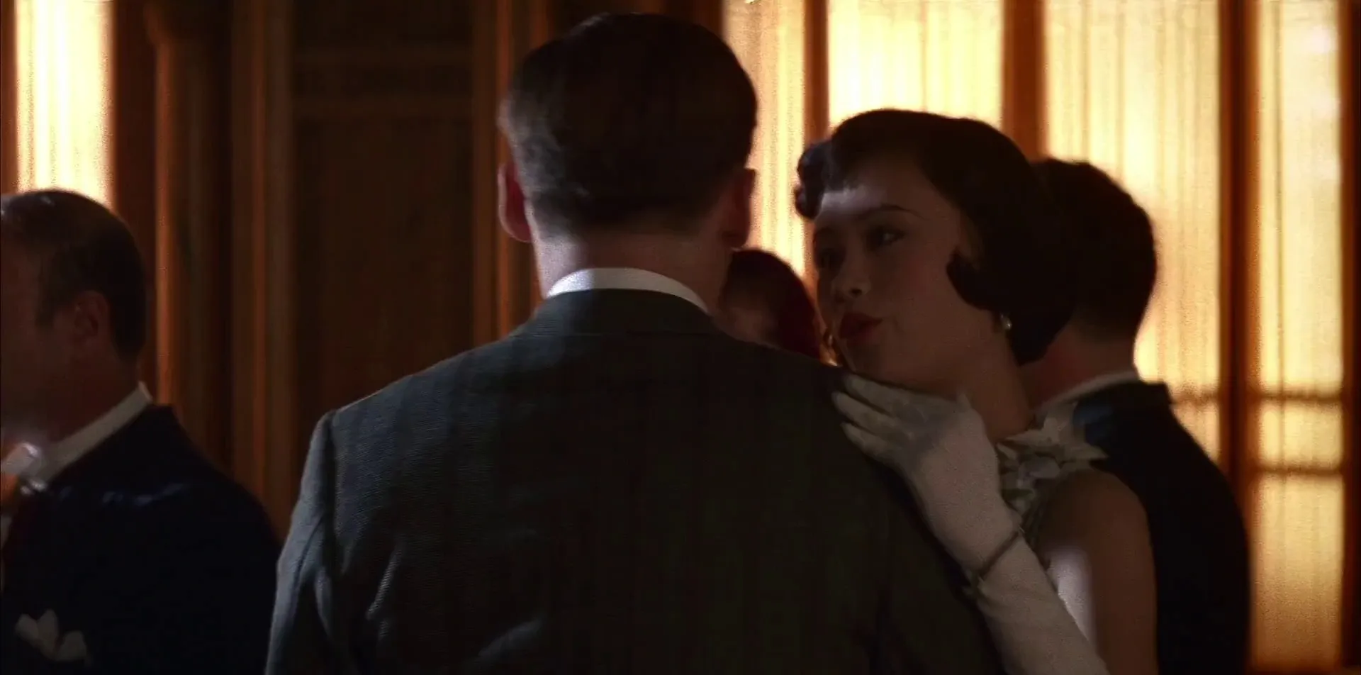
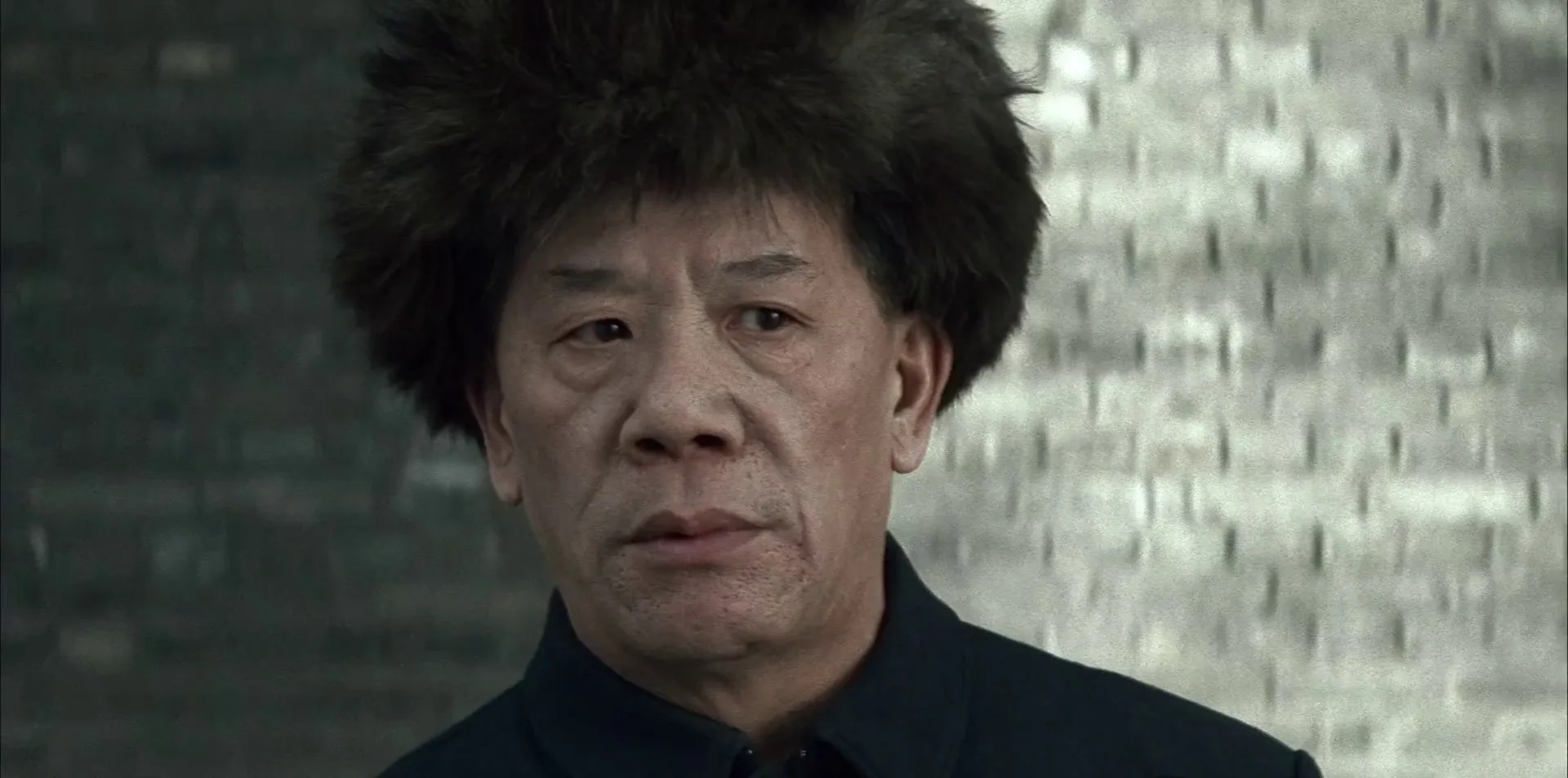
Then history happens to him, and the color drains out. By the time Pu Yi is a prisoner and then a citizen, the imperial reds and golds are gone, replaced by cold, desaturated grey-greens. Same man, opposite end of the spectrum — the palette tells you exactly how far he's fallen without a line of exposition. Put the frames side by side and the film's whole thesis is right there in the grade.
What his system is actually good for
You don't have to adopt Goethe to steal what's useful here. The lesson isn't "make everything blue when someone's sad" — that's how you end up with the kind of reflexive orange-and-teal grade worth knowing when to break. The lesson is to decide what your colors mean before you shoot, and then stay disciplined about it, so a shift in palette lands as an event rather than a whim. It's the same logic behind the way Moonlight uses three distinct looks to mark three chapters of one life — a modern film speaking Storaro's language whether it means to or not.
That kind of planning is hard to do in your head. It's much easier when you can pull the references that already say what you're after and set them next to each other — the warm frame beside the cold one, the way Storaro's arc reads at a glance — so your color logic is a thing your whole crew can see instead of a feeling only you can describe. That's exactly the reason to build a visual reference library before you ever load a camera: decide your language first, then go write with light.
How did you like this article?
Login to react to this article
Discussion (0)
💬 No comments yet. Be the first to share your thoughts!