Orange and Teal Color Grading, and When to Break It
Orange and teal color grading is everywhere for a reason. Here is the color theory behind the blockbuster look, when it works, and when to break it.

Orange and Teal Color Grading, and When to Break It
Pull up the trailer for almost any studio action film from the last twenty years and freeze on a wide shot. Odds are the shadows have drifted toward a cool blue-green and the faces glow a warm amber. You've seen it ten thousand times, probably without naming it. That's orange and teal color grading, and it became the default look of the blockbuster era for reasons that are half color science and half studio habit.
Worth understanding before you copy it. Orange and teal color grading pushes skin and highlights warm while shadows and backgrounds go cool, so actors separate cleanly from whatever is behind them. Done with intent, it gives a frame depth and punch. Done on autopilot, it flattens every movie into the same energy-drink palette. The difference is knowing why it works — and when your story is better served by walking away from it.
Why orange and teal actually works
The trick isn't arbitrary. Orange and blue sit directly opposite each other on the color wheel, which makes them complementary — the pairing with the strongest contrast between their exposure values. Cinematographers and painters have leaned on complementary color for depth long before anyone had a grading suite. Warm foreground against cool background reads as dimensional to the eye, no shallow depth of field required.
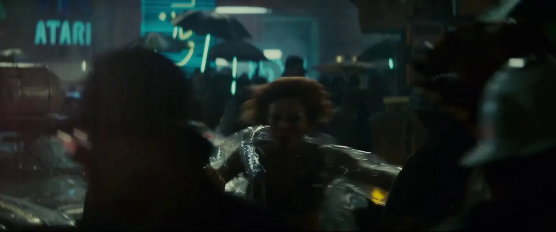
Then there's the human face. Skin tones, across a wide range of people, land somewhere in the orange-to-yellow band. Cool the rest of the frame toward teal and the skin pops forward automatically — no compositing, no rim light, just color separation doing the work. That single fact is why the look spread so fast. Nearly every narrative frame has a person in it, and this grade flatters the person for free. If you want to go deeper on reading a look from a still before you light it, that thinking carries straight over to using movie stills as lighting reference on set.
How it became Hollywood's default
The look didn't take over until the tools caught up. Once the digital intermediate replaced photochemical timing in the 2000s, colorists could anchor shadows cool and skin warm across an entire film and lock it with a LUT — a repeatable, sellable house style. Colorists like Stefan Sonnenfeld, the first colorist ever inducted into the Academy and the founder of Company 3, graded a run of tentpoles from Transformers to A Star Is Born and helped set the temperature of the modern studio image.
That repeatability is exactly why the look got tired. When any project can dial in the same grade with a preset, the palette stops meaning anything. It becomes wallpaper. A color choice should tell you something about the world of the film; a reflexive orange-teal pass usually tells you the colorist had a deadline.
When the look earns its keep
Push it far enough on purpose and it stops being wallpaper and becomes design. Mad Max: Fury Road, shot by John Seale and graded by Eric Whipp, is the case study everyone points to. George Miller wanted to reject the desaturated, bleached palette post-apocalyptic films had worn out for three decades. So the desert days were cranked toward pure saturated amber and the night sequences pushed hard into blue-teal — a two-color world that reads almost like a comic panel.
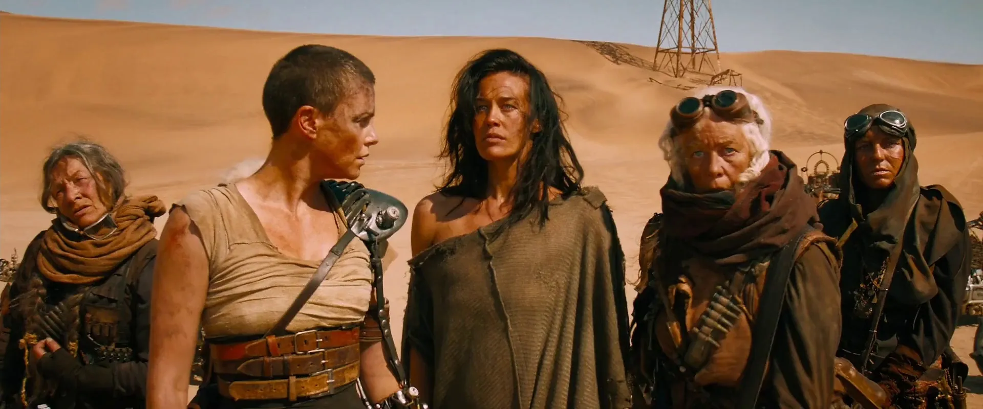
Whipp has said he kept telling himself to "make it look like a graphic novel," and the night look came from day-for-night footage shot two to three stops overexposed so he could pull it down cleanly in the suite. The point isn't the saturation level. It's that the color was a deliberate answer to a question about the story's world, not a preset. That's the bar. If someone asked why your shadows are teal and the honest answer is "that's just the look," you don't have a reason yet.
When to break it
The strongest argument against orange and teal is that a lot of stories are better without it. Naturalism is a real aesthetic choice, not the absence of one. Roger Deakins built a career on grades so restrained they barely announce themselves — the variables are mostly color temperature and tint, and the drama comes from lighting and staging instead of a stylized pass.
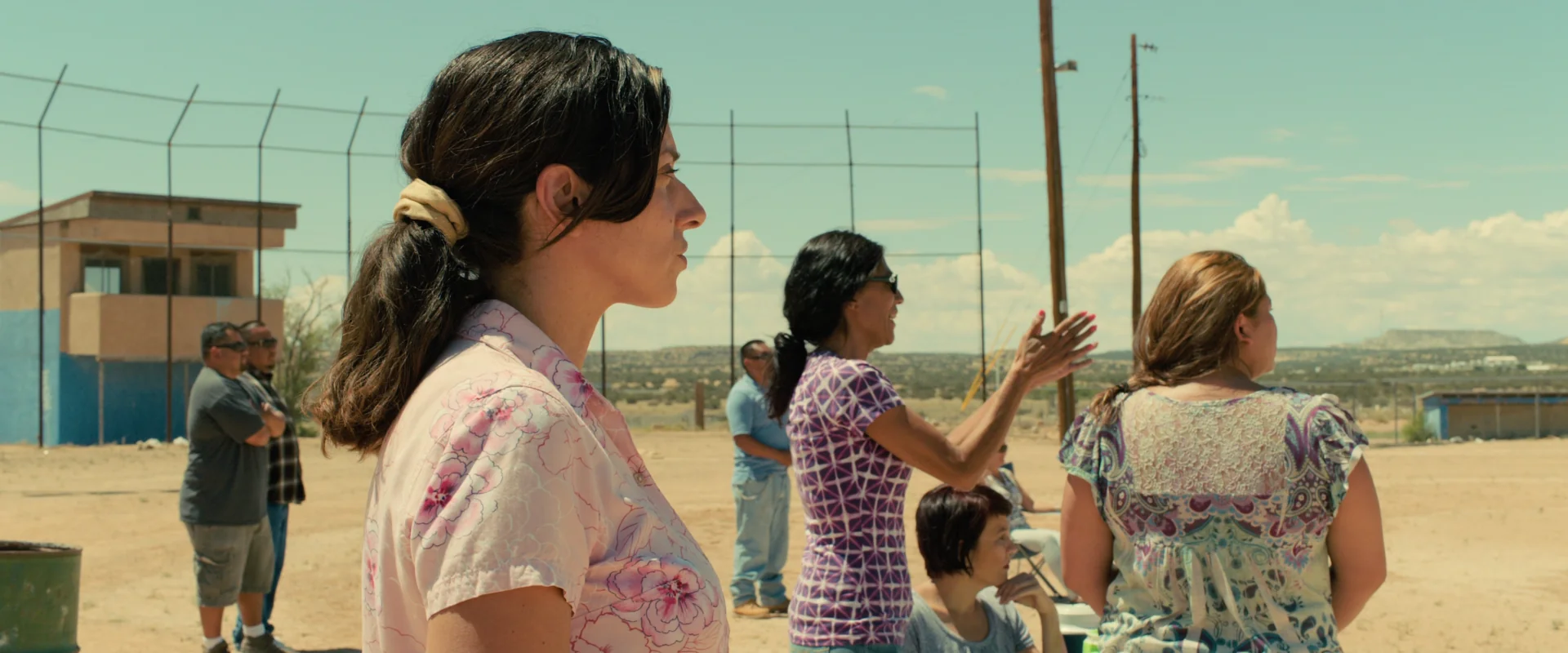
Look at his desert work in Sicario. There's warmth in the dust and coolness in the shadow, but it reads as observed light rather than a look bolted on in post. The frame feels like a place you could stand in. That restraint is a tool too, and for grounded drama, docu-style thrillers, or anything trading on realism, it usually beats the high-contrast blockbuster palette. Nolan's team makes a similar bet with density and contrast over candy color, which we broke down in Oppenheimer's colors and Nolan's frames.
Make the call before you shoot
The mistake isn't using orange and teal. The mistake is defaulting to it — or defaulting away from it as a reflex — without deciding what the color is supposed to say. That decision belongs in prep, not in the grade. Nail down your palette while you're still boarding and building the look, so the DP is lighting toward a target instead of hoping post can rescue it.
The cleanest way to lock a palette early is to pull real frames from films that already solved a version of your problem and study what they actually did with warm and cool. That's the whole reason to build a visual reference library before your shoot — searchable stills you can line up side by side, compare, and hand to your colorist as a target instead of a vibe. Pick the palette on purpose, and orange and teal becomes a choice you own rather than a habit that owns your movie.
How did you like this article?
Login to react to this article
Discussion (0)
💬 No comments yet. Be the first to share your thoughts!