How to Build a Color Palette for Your Film Before You Shoot
Stop rescuing your color in the DI. A palette is a prep decision — hand it out to characters, acts, and locations before you roll a single frame.

The grade is where most color decisions actually get made, and that's the problem. A colorist opens the timeline, starts pushing the shadows cool and the skin warm, and a "look" gets improvised in a dark room weeks after the sets are struck and the costumes are back at the rental house. That improvised rescue is what a lot of people mean when they say color palette. It shouldn't be.
A real film color palette is a decision you make in prep — before a single frame is exposed. It tells the production designer which walls to paint, the costume department which reds to pull, the gaffer which gels to hang, and the DP where to point the light. Done right, the DI is just protecting a plan you already made. Done as a rescue, the grade is fighting the footage.
Here's how to build that plan before you roll.
Start with what the color is for
Color that means nothing is just decoration, and decoration is the first thing that reads as fake. Before you pick a single hue, decide what job it's doing in the story. Is it separating timelines? Tracking a character's decline? Marking the difference between the world she's escaping and the world she's running toward?
Steven Soderbergh built the whole structure of Traffic (2000) on this. Shooting under his Peter Andrews pseudonym, he gave each of the three storylines a filter you can name from across the room: a tobacco-tinted yellow for the Mexico thread, achieved with actual filters and a pushed Ektachrome process, and a cold, sourceless blue for the Washington story. You're never confused about which world you're in, because the color told you before the dialogue did. That's a palette doing narrative work, and it was locked long before post.
So the first question isn't "what's pretty." It's "what does the audience need to feel or track, and can color carry it." If color isn't carrying anything, you don't need a scheme — you need one honest look, well executed.
Assign colors to people, places, and acts
Once you know the job, hand out the colors like roles. The three most useful buckets:
Characters. Give a person a color and let their costume and their surroundings carry it. It doesn't have to be loud. It just has to be consistent enough that the audience learns it without being told.
Locations. A safe house, a childhood home, a corporate office — each can own a temperature and a family of hues so that a cut to a place also feels like a cut to a mood.
Acts. This is the strongest tool most productions never plan. Let the palette evolve as the story does.
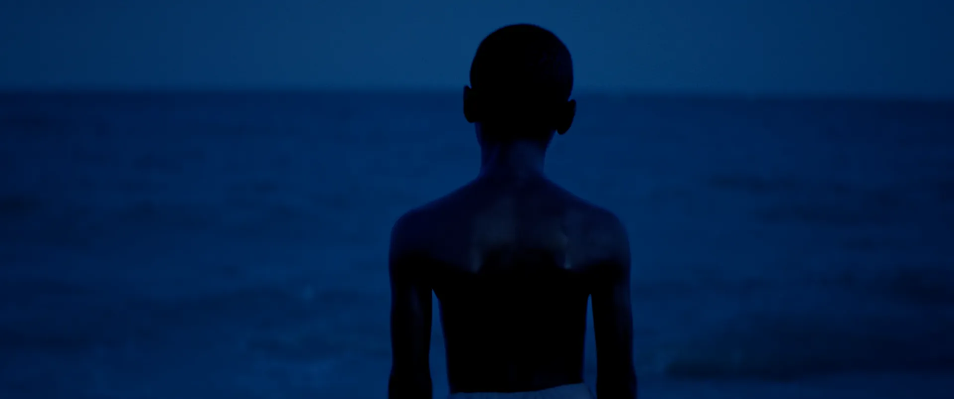
Moonlight (2016) is the cleanest example on record. Barry Jenkins and DP James Laxton built each of the film's three chapters around a different look, drawing on the character of specific film stocks to shift the color as Chiron grows — warmer and softer in childhood, cooler and more alienated in adolescence, hardened into deep greens and blues by adulthood. The blue that runs through it isn't a grading preset; it's a through-line the whole production committed to. That kind of arc only works when the palette is designed as a sequence, not discovered shot by shot. (We broke the full three-stock approach down in our Moonlight cinematography breakdown.)
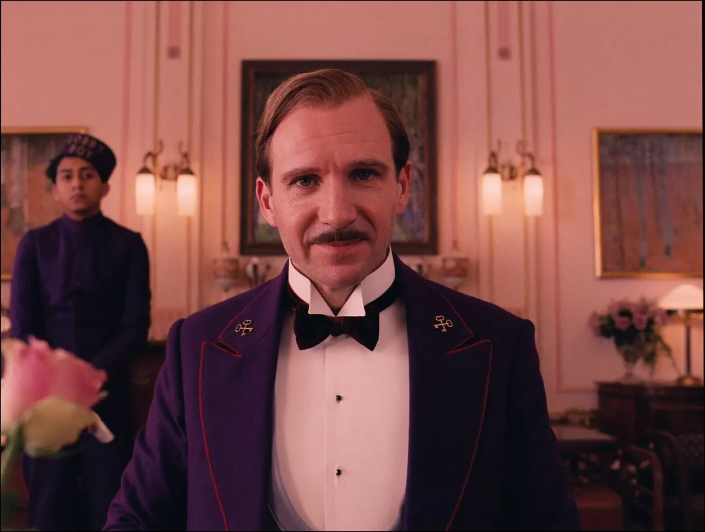
The same logic scales down. In The Grand Budapest Hotel (2014), Wes Anderson and DP Robert Yeoman gave the hotel's boom years a palette of pinks, reds, and purples — the concierge's staff literally wearing plum against those blush walls — while the film's later, sadder timeline drains toward grey. Production designer Adam Stockhausen has talked about the discipline it took: they had to pull the pink back with yellows and other colors so the eye wouldn't stop registering it. Even a maximalist palette is a set of rules.
Subtraction is a design choice too
A palette isn't only the colors you use. It's the ones you forbid. Deciding what not to let on screen is often what gives a film its signature more than any single accent.
On Her (2013), Spike Jonze, DP Hoyte van Hoytema, and designer K.K. Barrett agreed on rules before the shoot — cutting certain colors, deliberately starving the frame of the cold blues and greens that read as "sci-fi," so a near-future Los Angeles could feel warm, intimate, and lonely instead of chilly and technological. What's left is a world built on reds, blush, and warm neutrals. The restraint is the design.
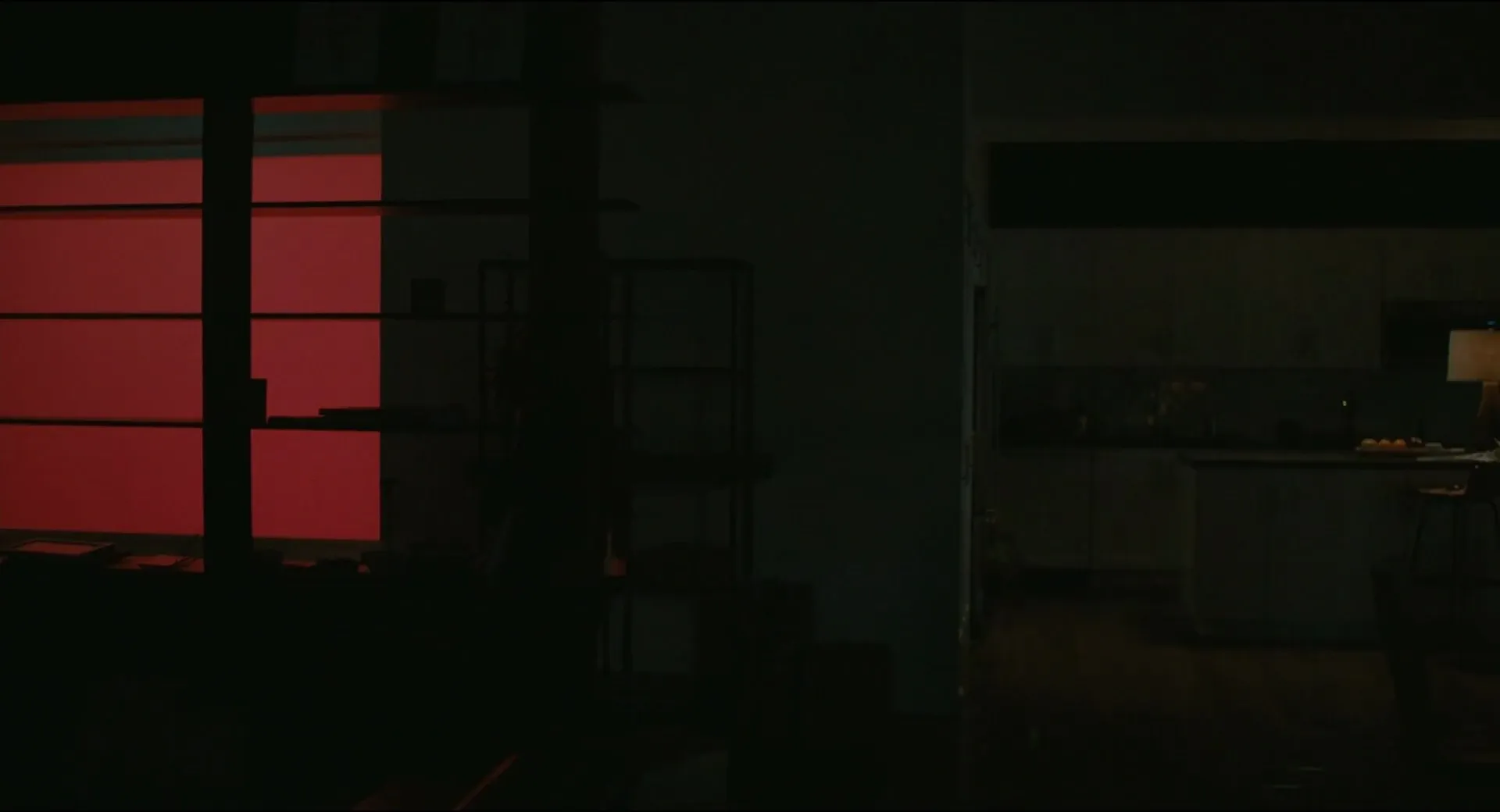
Try it on your own project: write the ban list next to the palette. "No pure black. No saturated green until the third act. Skin stays warm no matter the environment." Constraints like these travel better to your departments than a mood board full of vibes, because they're testable on the day. Vittorio Storaro spent a career arguing that color is a language with its own grammar — and grammar is as much about what you leave out as what you say.
Build your color palette from real frames, not swatches
Hex codes lie. A color chip in a slide deck tells you nothing about how that hue behaves under tungsten, how it sits next to skin, or what a lens does to it wide open. The only reliable way to design a palette is from actual cinematography — frames where someone already solved the problem of making that color live on film.
This is where the work moves from theory to something your crew can act on. Pull frames that show the exact relationship you're after — a character's color against their environment, a location's temperature, the way an act should shift — and build your palette from what you can see, not what you can imagine. Assign each key relationship two or three reference frames, and suddenly the conversation with your production designer and DP is concrete: this red, at this brightness, against this wall.
That's the whole reason to keep a working visual reference library instead of a scatter of screenshots. In StillsLab you can search the frame library by film, by look, or by color, save the frames that define each beat of your palette into a project, and hand your departments a plan built from real images rather than a paragraph of adjectives. When the palette lives next to your shotlist, the grade stops being a rescue — and starts being the last, easy step of a decision you made months ago. If you've been reaching for orange and teal by default, this is the upstream fix.
Build the palette in prep. Let the grade protect it, not invent it.
How did you like this article?
Login to react to this article
Discussion (0)
💬 No comments yet. Be the first to share your thoughts!