Dune: Part Two: How Greig Fraser Shot Giedi Prime in Infrared
Real infrared, not a grade — and once the filters came out, there was no going back. Inside the gamble that made the Harkonnen homeworld feel wrong.

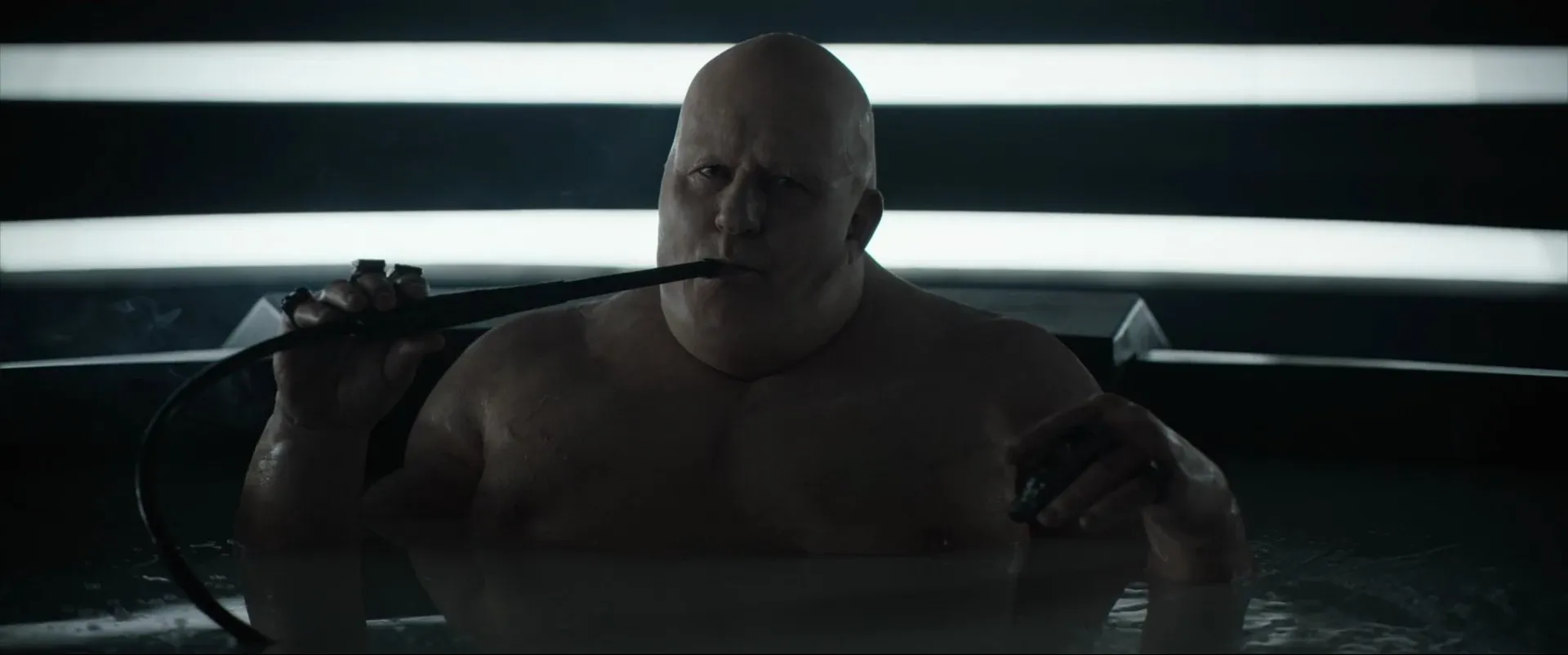
About forty minutes into Dune: Part Two, the picture drains. The Harkonnen homeworld of Giedi Prime arrives not in color but in a hard, silvered black-and-white — skin gone chalk-pale, a crowd bleached to bone under a sun that gives off no warmth at all. Everyone who saw it in a theater noticed. What most didn't clock is that it isn't a grade. Greig Fraser shot those sequences on cameras rebuilt to see only infrared, a band of light our own eyes can't register, and once he committed there was no undo button.
That single decision is the most instructive thing about Dune Part Two cinematography. Not because infrared is a trick you'll reach for next week — you probably won't — but because of how it was reasoned, tested, and locked down. It's a case study in choosing a look for a reason and then refusing to hedge.
The idea came out of the sun
The premise started with Denis Villeneuve, not the camera department. He wanted Giedi Prime to read as a different order of place inside an already monochrome-leaning film, and he found the logic in the world itself: the Harkonnen sun is a black sun that doesn't reveal color, it kills it. Villeneuve has described the notion that "instead of revealing colors," Giedi Prime's daylight "will kill colors," showing "their own world" as "a bleak black-and-white world" that tells you something about Harkonnen psychology. It even back-explains the look of the Harkonnens themselves — the pallor, the hairlessness — as what a species becomes under a sun that emits no visible light.
That's the part worth underlining. The black-and-white wasn't an aesthetic bolted on for cool factor. It was a piece of world-building that happened to be visual, which is exactly why it survives on screen instead of feeling like a stunt.
Why real infrared instead of a filter in post
Here's where most productions would flinch. You could get 90% of the way to that look by shooting normally and desaturating hard in the grade. Fraser didn't want the 90% version, and the reason is technical: infrared doesn't just remove color, it re-renders tone. Materials that look one value to your eye record as a completely different value on an infrared sensor. Skin, fabric, foliage, sky — they all shift. That tonal reshuffling is what makes the Harkonnen world feel wrong in a way a normal black-and-white conversion never could.
Because ARRI Rental didn't have enough native monochrome Alexa bodies for the shoot, the team took standard Alexa cameras and stripped out the internal infrared-cut filters, then added a filter in front of the lens to block almost all visible light from reaching the sensor. What's left is essentially only infrared. Fraser has said his fascination with the band is simple — "our eyes can't see it, but the camera can."
And there was no safety net. Villeneuve has been blunt that he "had to warn the studio that there was no way back. It's not an effect that we did in post-production." Once the filters come out and you've shot a scene that way, you own it. That kind of commitment is rare precisely because it removes the option to change your mind in the edit — which is also why it works.
Shooting a world you can't see
The catch with infrared is that nobody on set can preview it with their own eyes. Fraser has described the core problem plainly: something that looks black to you might record as white, something gray might read as black, and you can't reliably guess which. In one test, two crew members each wore a black T-shirt — through the infrared camera, one turned white and the other stayed black. There's no eyeballing your way out of that.
The workaround was mechanical. The production ran a 3D rig — the kind normally used to shoot stereoscopic films — with a color camera on one side and the infrared camera on the other, so they could reference a normal image against the infrared one in real time. That also meant lighting the set twice over: emitters that put out infrared for the modified camera, plus LEDs that put out visible light with no infrared for anyone working in the room. Fraser was even pulled back deep into post to re-photograph fully-CG shots on a virtual camera, so the infrared "photography" stayed consistent even where nothing physical was in front of a lens.
None of that is glamorous. It's the unglamorous discipline — test, measure, build a rig, light for two spectra at once — that lets a bold idea actually land.
The point is contrast, not the gimmick
Strip away the engineering and the reason it works is old-fashioned: contrast. The rest of Dune: Part Two is enormous, warm, large-format desert — Arrakis rendered in tactile amber and sunbleached ochre.
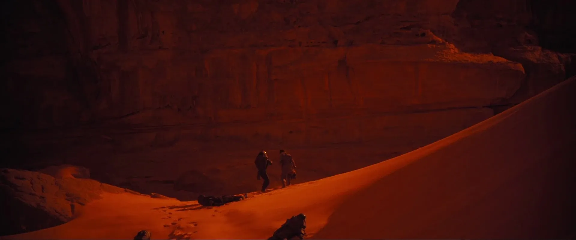
Cut from that to Giedi Prime and the infrared monochrome hits like a temperature drop. The technique characterizes the Harkonnens before a word is spoken, and it only reads that hard because it's reserved for one world. If the whole film looked like that, it would be a style. Used once, deliberately, it's a statement. That restraint is the same instinct behind Fraser's broader approach to the film — shooting for enormous scale without losing the human face — and it's of a piece with the large-format, IMAX-minded thinking that's reshaping how event films are captured.
The takeaway for your own work isn't "go rent infrared cameras." It's that Fraser and Villeneuve decided what a place should feel like, found a technique that made that feeling physically true, tested it until they trusted it, and then committed with no exit. Most look decisions die in the grade because they were never really decisions — just options left open too long. The strongest ones, like this, are settled before the camera rolls, which is really an argument for building your palette and your look before you shoot.
That's the stage where a reference library earns its keep. Pulling real frames — the Giedi Prime monochrome, the warm Arrakis exteriors, whatever look you're chasing — into one place where your director and DP are pointing at the same image is how a bold call gets made with confidence instead of hope. It's exactly what StillsLab's visual reference library is built for: decide the look while it's still cheap to decide, then go shoot it like you mean it.
How did you like this article?
Login to react to this article
Discussion (0)
💬 No comments yet. Be the first to share your thoughts!