High-Key vs Low-Key Lighting: Picking Contrast Before You Pick Lights
Contrast ratio is the first creative call on any scene, long before the truck is unloaded. Here's how to make it on purpose.

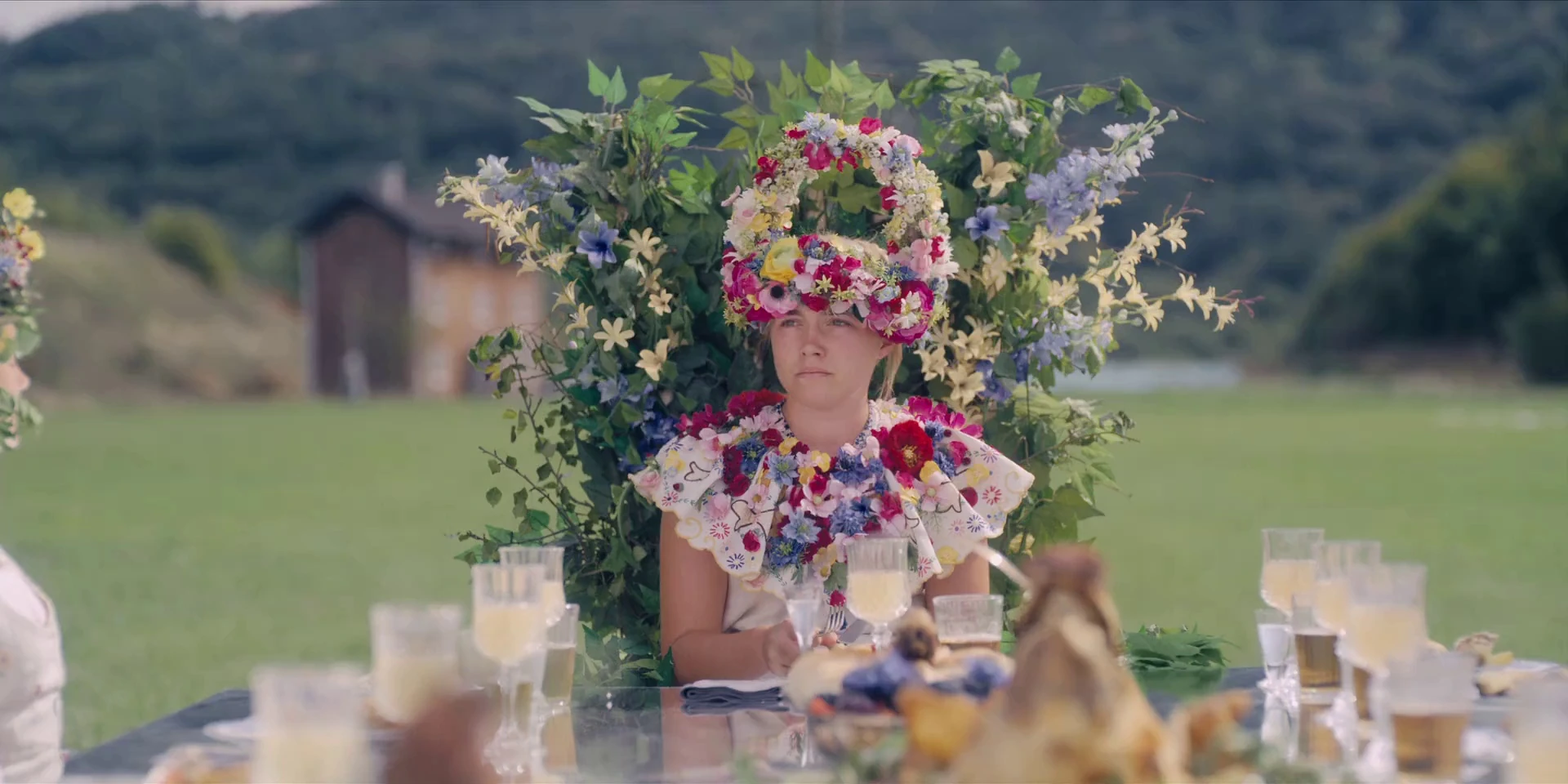
Two DPs get handed the same setup: a woman alone at a table, about to hear the news that ends her. One lights it so bright and flat that every pore shows and nothing in the room can hide. The other lets the space go dark until a single sliver of key catches one cheek. Same blocking, same actor, two completely different films. That gap is the choice between high-key vs low-key lighting, and you make it before you've touched a single fixture.
Both terms describe one thing: contrast ratio — how far your shadows fall below your highlights. High-key means a low ratio, fill sitting close to key, shadows soft or filled in almost completely. Low-key means a high ratio, little or no fill, shadows allowed to crush to black. Everything else — how many units, what modifiers, where the practicals live — comes after that call. Get the ratio wrong and no amount of pretty light saves the scene.
Contrast ratio is a story decision, not a gear decision
The mistake is treating contrast as a byproduct of your package. You rig the space, you see what you get, you call it a look. Backwards. The ratio is a statement about how much the audience is allowed to know, and you should be able to name it before the truck opens.
Ask what the scene is doing. Is this a character with nothing to hide, in a world that isn't threatening them yet? That wants a flatter ratio — the frame withholds nothing because the story isn't withholding anything. Is this a character keeping a secret, or a world that's closing in? Let the shadows do the withholding for you. Half the frame in black tells the audience there's something they can't see, without a line of dialogue spent on it.
This is why "high-key vs low-key lighting" is a script question first. Read the scene, decide what the frame should confess and what it should keep, then pick a ratio that matches. The lights are just how you hit the number.
When the flat, shadowless look is the right call
High-key gets dismissed as the sitcom default — bright, even, no drama, the look you use when you're not trying. That's lazy. A low contrast ratio is a real choice with a real effect: it flattens the emotional read, removes the menace, and makes a space feel safe, open, and legible. Comedy lives here for a reason. It's hard to land a joke when half the actor's face is buried; the audience needs to see the full performance, clean and unhidden.
Musicals reach for it too, because energy reads better in even light — you want the whole stage, every dancer, no mystery. There's nothing to be suspicious of, so nothing hides.
The interesting part is what happens when you point that same flat light at something that should be frightening. In Midsommar, DP Pawel Pogorzelski and director Ari Aster made a hard rule: the horror would never come from darkness. They shot the whole thing in the near-constant daylight of a Swedish summer, bloomed the highlights on Panavision's large-format glass for a storybook glow, and left the audience with no shadow to hide in. The brightness becomes the threat. Every unspeakable thing happens in full, even light, and you can't look away from any of it.
That's the lesson high-key actually teaches. Flat, shadowless light isn't the absence of a decision — it's a specific one. It says: look at everything. Sometimes that's comforting. Sometimes it's the most disturbing thing you can do to a frame.
When to let half the frame fall to black
Low-key is the opposite bet. You raise the ratio, kill the fill, and let the shadows carry as much of the frame as the story can stand. Done with intent, it's not underlit — it's controlled subtraction. You're deciding what the audience doesn't get to see.
Nobody made that argument harder than Gordon Willis on The Godfather. Willis earned the nickname "Prince of Darkness" for shooting at light levels Hollywood in 1971 simply didn't use — underexposed negative, near-absolute blacks, and no eye light on his lead. He deliberately let shadow swallow Marlon Brando's eyes so you could never quite read Vito Corleone, and the film's opening cuts the bright wedding outside against the dim office inside, the two ratios doing the moral work of the scene. If you want the full breakdown of that approach, we went deep on Willis and the case for burying the eyes separately.
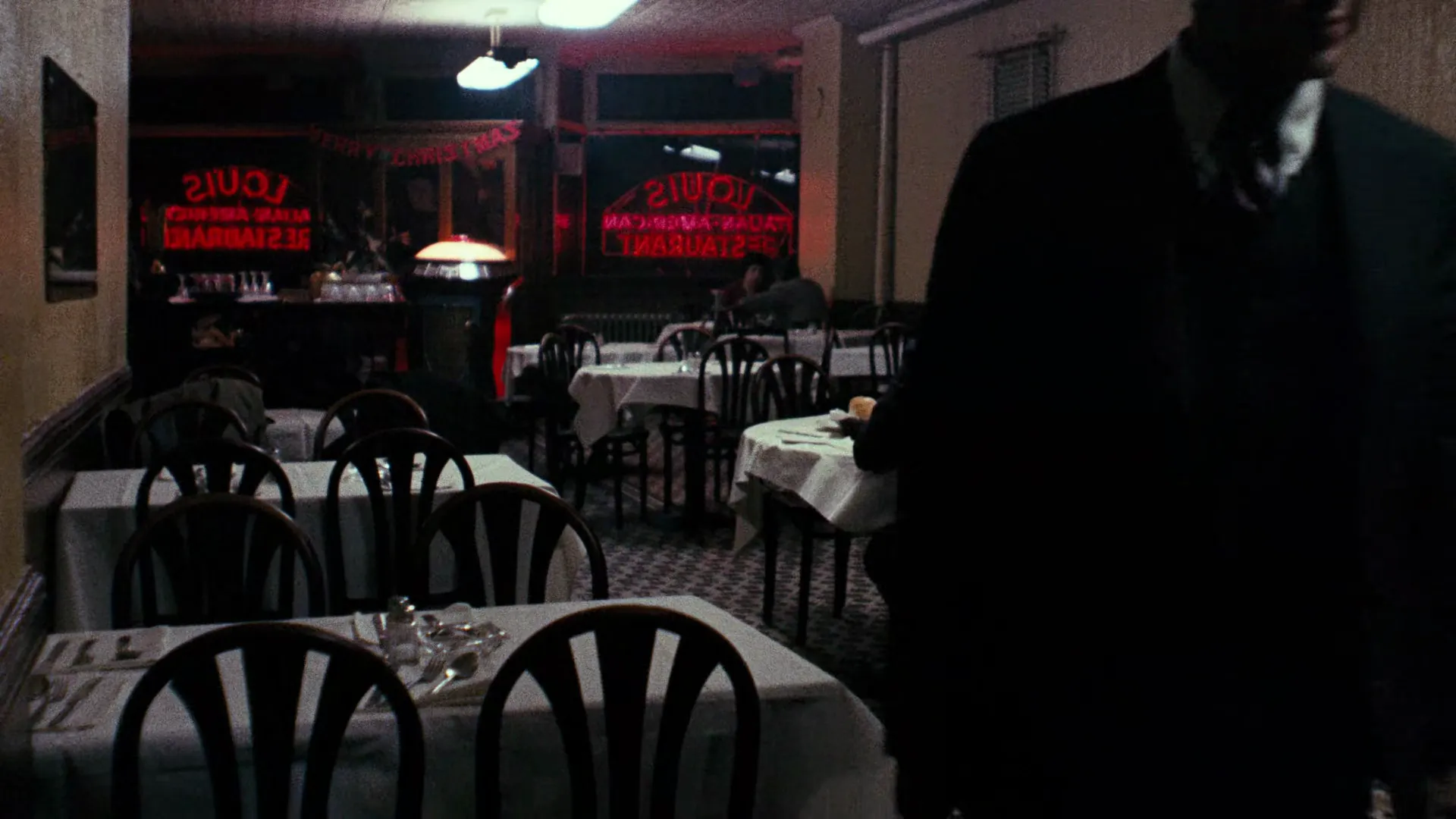
The look predates Willis, of course. Robert Krasker won the Academy Award for his black-and-white photography on The Third Man, all wet cobblestones, canted angles, and a single key wrapped around a far corner while the rest of the street drowns in dark. And you can push it even further: Jarin Blaschke's Oscar-nominated, black-and-white orthochromatic work on The Lighthouse crushes nearly the entire frame to black and leaves one catchlight burning in an eye. There's almost no information left. That's the point.
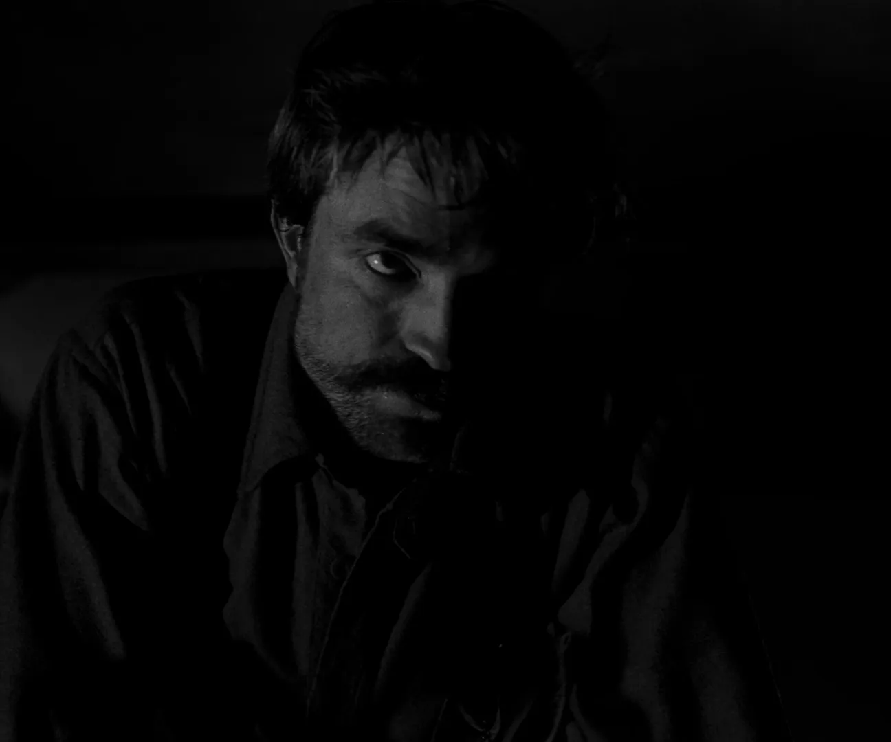
The trap with low-key is confusing dark with lazy. Deep shadow only works when you've chosen exactly where the light lands and protected it. That takes more control than filling everything, not less — which is the whole argument for shooting in shadow and treating underexposure as a tool rather than an accident.
Pick the contrast before you pick the lights
Here's the working order. Before you spec a single unit, decide the ratio the scene wants — flat and confessional, or steep and withholding — and write it down next to the scene number. Then rig toward that number. A 2:1 scene and a 16:1 scene might use the same key; what changes is how hard you fight the shadows, and that's a decision you should be making on paper, not discovering on the floor.
The fastest way to get everyone agreeing on the number is to point at a frame instead of describing it. "More contrast" means nothing; a still from The Godfather next to a still from Midsommar settles the argument in two seconds. This is where a shared visual reference earns its place — pull the exact frames that show the ratio you're after, drop them into your lighting reference for the shoot, and hand your gaffer a target instead of an adjective. StillsLab's library exists for exactly that: find the look, save the frame, and make the contrast call before the first fixture ever comes off the truck.
How did you like this article?
Login to react to this article
Discussion (0)
💬 No comments yet. Be the first to share your thoughts!