How to Choose an Aspect Ratio for Your Film
The shape of your frame does as much narrative work as anything inside it — here's how to pick it on purpose.

Most productions never actually choose an aspect ratio. The camera arrives set to whatever the rental house left it on, the monitor shows a 16:9 rectangle, and that becomes the shape of the movie by default. Nobody in the room decided the frame should be that wide or that tall. It just happened.
That's a missed opportunity, because the shape of the frame is one of the few decisions that touches every single shot. Choosing an aspect ratio for film is a storytelling call, not a technical formality — the proportions of the rectangle change how a face reads, how much world sits around a character, and how big or trapped the whole thing feels. Before you block a scene, it's worth knowing what each frame shape actually does.
The two ratios most films default to
For theatrical work in North America there are really two standard containers, and it helps to know them by name. Flat (1.85:1) and Scope (2.39:1) are the two shapes cinemas are built to project — everything else is a variation or a deliberate break from these. Flat has been the American theatrical standard since the 1960s; Scope is the wide anamorphic frame most people picture when they think "cinematic." Digital delivery formalizes both: a DCI-compliant package is either Flat or Scope, with a slightly wider 1.90:1 "full container" sitting between them.
The practical difference is width. 1.85:1 is close to what a phone or TV shows you — roomy, but still a normal rectangle. 2.39:1 is dramatically wider, and that extra width is the whole point. It's not just "bigger." It changes what you can hold in a single frame.
What going wide actually buys you
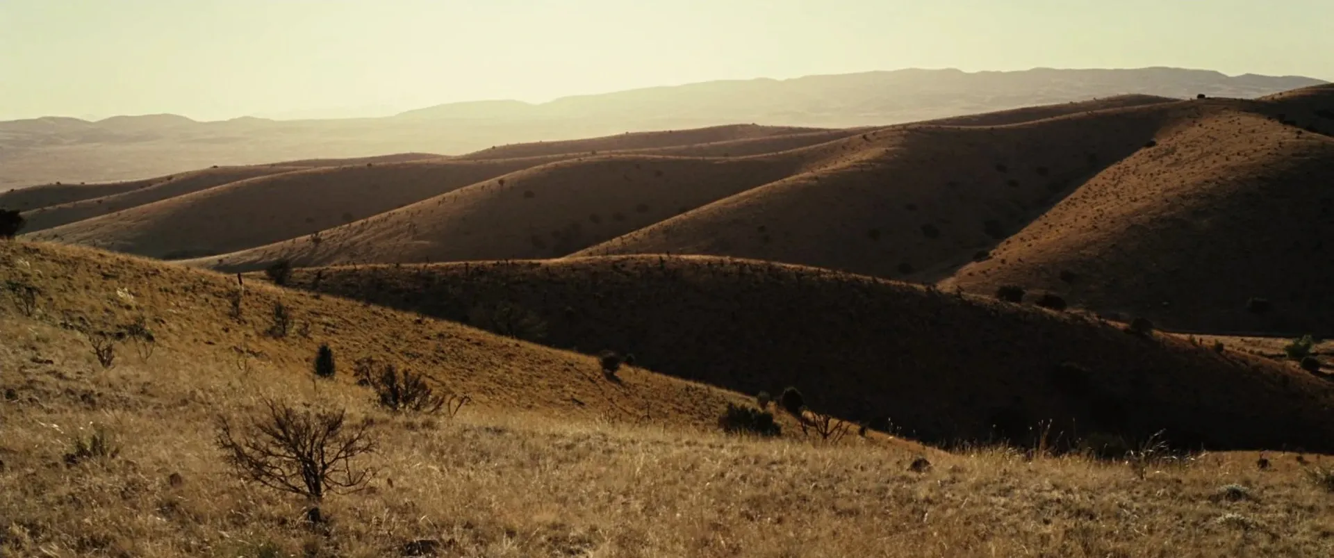
Scope gives you room to put a person on one side of the frame and let the world push in from the other. Empty space stops being dead space and starts doing work — isolation, threat, scale. Roger Deakins' landscapes in No Country for Old Men are the textbook case: the human being is small, the land is enormous, and the frame keeps reminding you of that.
The catch is that wide frames are hard to fill. A 2.39:1 shot of two people talking in a small room leaves a lot of rectangle to account for, and if you don't have a plan for that space, it reads as empty rather than composed. Scope rewards landscapes, staging in depth, and lateral movement. It punishes lazy singles.
When you box it in instead
Go the other direction and the frame gets taller and tighter. The Academy ratio (1.37:1) — the near-square shape that was the studio standard before widescreen — has quietly come back as a deliberate choice. Paul Schrader shot First Reformed in it precisely because everything feels boxed in, with almost no empty space around the character; he's said Paweł Pawlikowski's Ida convinced him the vertical frame "drives the vertical lines, so you get more of the human body in the frame."
You can push even further. Robert Eggers and DP Jarin Blaschke shot The Lighthouse in a nearly square 1.19:1 — an obscure early-sound-era ratio Blaschke first floated half as a joke — to make the two men feel physically trapped inside the frame. Xavier Dolan went all the way to a literal 1:1 square in Mommy, so the audience sits right in his characters' faces with no room to look away, then let the image expand to widescreen in the film's few hopeful moments. In each case the tighter frame isn't a limitation. It's the emotion.
The tall frame: IMAX and large format
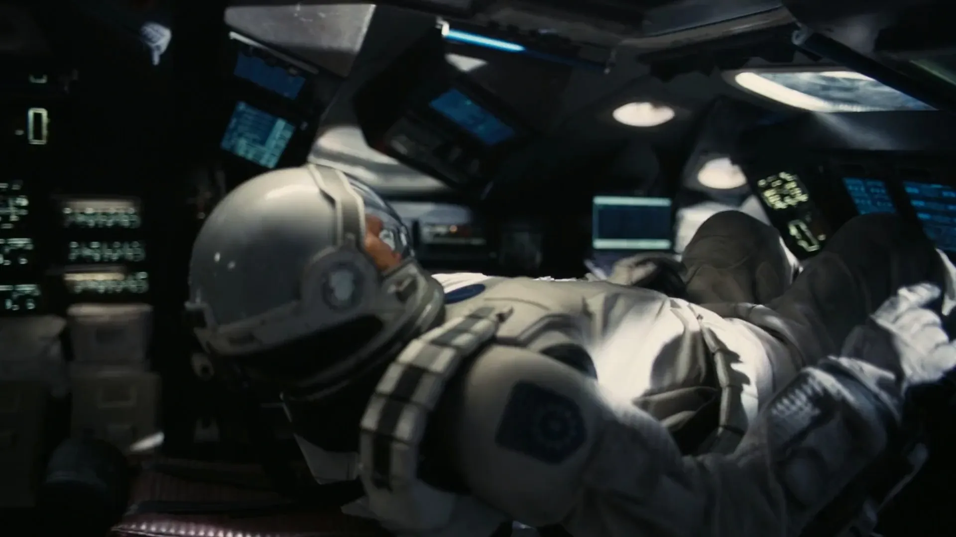
There's a third direction that only really exists on the biggest screens. Christopher Nolan's IMAX work isn't just higher resolution — native IMAX film is framed at 1.43:1, taller than any normal theatrical shape, and it wraps the audience rather than sitting in front of them. About an hour of Interstellar was shot that way, cutting between 1.43:1 IMAX for the immersive material and 2.39:1 for the rest.
Oppenheimer pushed the idea further, switching between a widescreen 2.20:1 on 5-perf 65mm and the towering 1.43:1 IMAX frame — Nolan even cuts from an IMAX reaction shot to a 65mm dialogue shot inside the same scene. Almost nobody reading this is shooting native IMAX, but the principle scales down: a taller frame pulls you into a space, a wider one lays it out in front of you. Knowing which sensation you want tells you which way to stretch the rectangle.
Changing the ratio mid-film
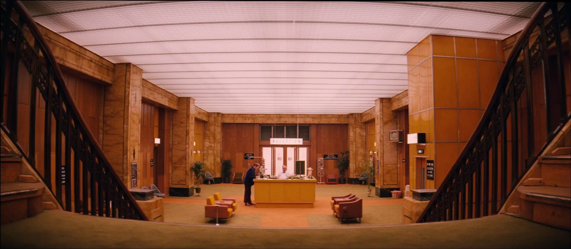
The frame doesn't have to stay fixed. Wes Anderson built The Grand Budapest Hotel out of three ratios, one per timeline: the 1930s story in boxy 1.37:1 Academy, the 1960s material in wide 2.35:1 anamorphic, and the modern framing device in standard 1.85:1. The shape itself tells you which era you're in before a single word of dialogue.
This is powerful and easy to overdo. A ratio shift only lands when it maps to something real in the story — a jump in time, a change in a character's state, a move between two worlds. If you're switching frames just because you can, the audience feels the gimmick. If the shift means something, most viewers won't consciously clock it, but they'll feel the film reorganize itself around them. The same logic that governs a good centered, symmetrical composition applies here: the format is invisible until it's motivated, and then it's the whole point.
How to actually pick an aspect ratio
Strip away the reference films and the decision comes down to a few honest questions. How much of the world matters relative to the people in it? Scope if the environment is a character; a tighter frame if the face is the entire movie. Where is your movie going to be watched — a theater, a laptop, a phone held vertically? Do intimacy and confinement serve this story, or does it need to breathe?
Answer those before you fall in love with a look you saw somewhere else. A 2.39:1 anamorphic frame is gorgeous in a trailer and miserable if your film is three people in a kitchen, because you'll spend the whole shoot fighting to justify the width. The ratio has to fit the story you're actually making, not the one in the reference clip.
That's exactly why it pays to study frames at each ratio before you commit — pull a scope landscape, an Academy interior, and an IMAX-scale wide next to each other and the differences stop being abstract. Building that comparison is what a searchable visual reference library is for, and once you've picked your frame shape, note it on the shotlist so every department is composing for the same rectangle from day one. Choose the frame on purpose, and it starts working for you before the actors even show up.
How did you like this article?
Login to react to this article
Discussion (0)
💬 No comments yet. Be the first to share your thoughts!