Wes Anderson's Symmetry: Why Centered Framing Works
How Wes Anderson's symmetry and centered framing actually work on set — the planimetric look, the whip pans, and what indie DPs can steal from it.

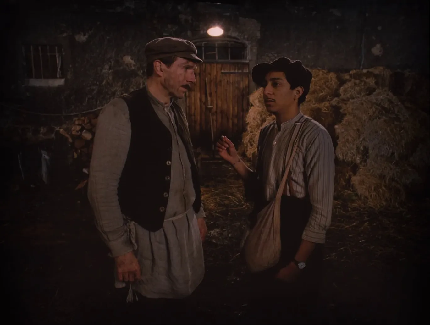
Robert Yeoman has a ritual before every wide shot. His camera assistant measures the distance from the lens to each corner of the room, because the moment Wes Anderson walks onto set, the first thing he asks is whether the camera is square to the wall. Not roughly square. Dead square. Yeoman shot every live-action Anderson film from Bottle Rocket to Asteroid City, and after nine features he still starts each setup the same way — hunting for the exact center of the room.
That obsession is the whole engine behind Wes Anderson's symmetry. Centered framing isn't a filter he adds in the grade; it's a decision that reaches all the way back into how the set gets built. Understanding why it works — and when it doesn't — is more useful to a working DP than admiring the results.
The rule Anderson throws out
Most of us learn the rule of thirds before we learn anything else, then spend years placing eyes on the top gridline out of muscle memory. Anderson does the opposite. He puts the subject dead center and dares you to notice.
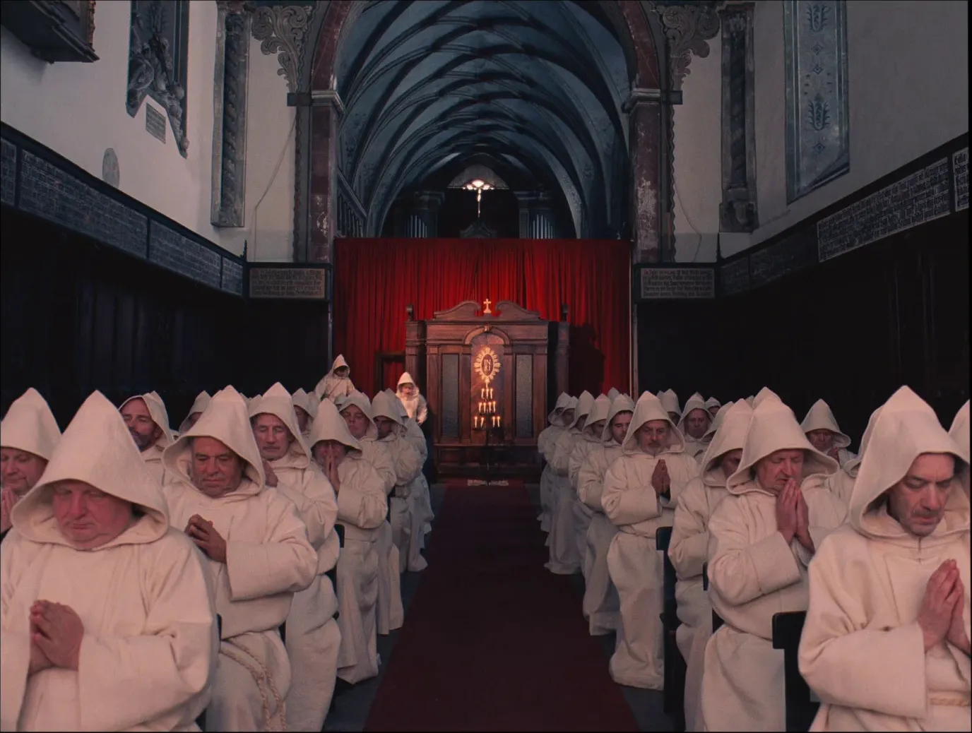
Centered composition should feel static, and in most films it does — that's why the rule of thirds exists, to give the eye somewhere to travel. Anderson gets away with breaking it because everything else in the frame is doing the traveling: a bellboy sprinting through the lobby, a whip pan snapping to the next character, a pastel box of a room framing a face that refuses to move. The stillness of the center becomes the joke, or the ache, depending on the scene.
It only holds together because the symmetry is real. If the lamp on the left has no twin on the right, the whole frame tips over and reads as a mistake instead of a choice. That's why Yeoman's tape-measure ritual matters. Symmetrical composition has zero tolerance for "close enough."
Why Anderson's symmetry looks flat
There's a second thing going on that people feel before they can name it. Anderson shoots what's called planimetric composition — the camera sits perpendicular to the back wall, so foreground, midground, and background stack up like flat planes instead of receding into depth. It's the same one-point perspective a kid uses drawing a hallway: everything converges on a single vanishing point, dead center.
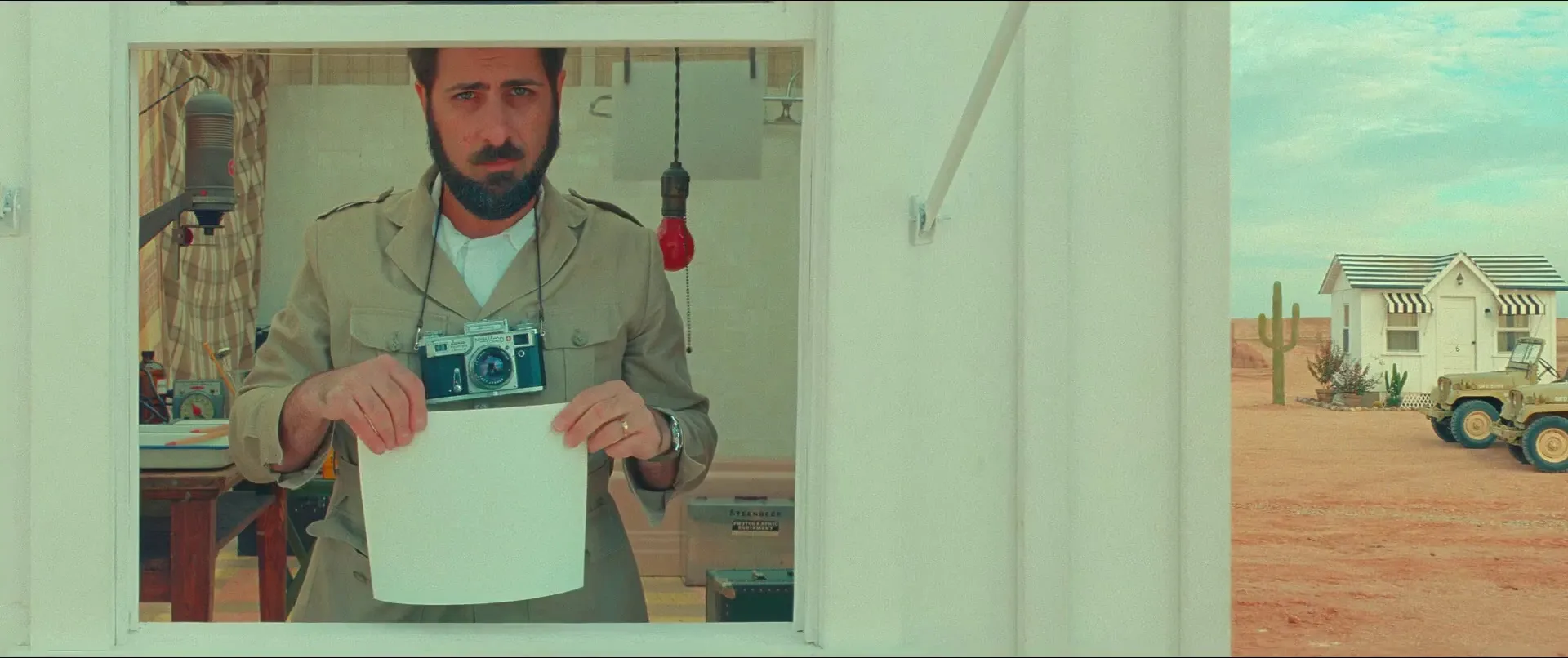
Blocking follows the geometry. Characters move in straight lines — left, right, toward camera, away from it — like pieces on a board. When the camera does move, it tends to snap in 90- or 180-degree increments: the whip pan that flicks from one face to another, the push-in straight down the axis. Kubrick used the same one-point perspective to make hallways feel like a threat. Anderson uses it to make a desert motel feel like a dollhouse someone forgot to stop playing with.
Symmetry survives without a camera
The clearest proof that this is design and not just a lens trick is Fantastic Mr. Fox. It's stop-motion — no real camera, no real room, every frame built by hand on a miniature set by DP Tristan Oliver — and it still looks unmistakably like Anderson.
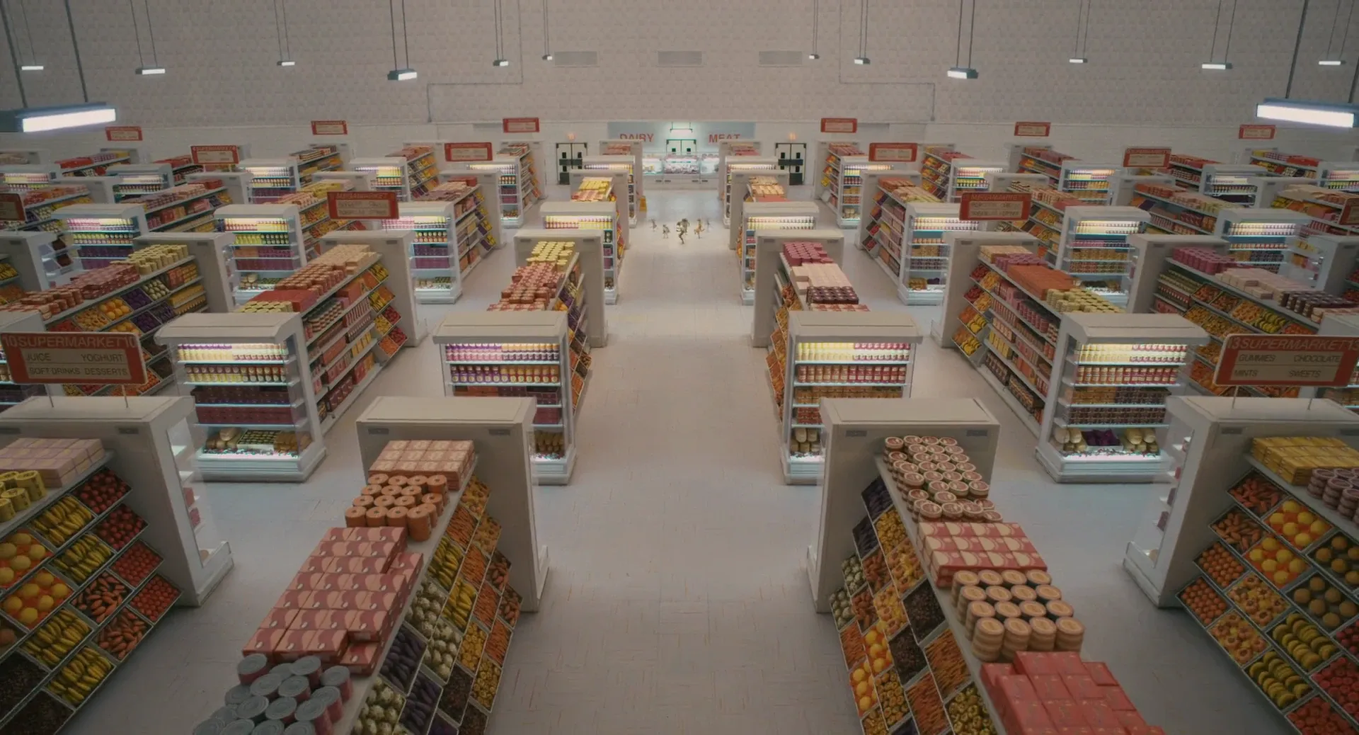
Oliver leaned into a tight, warm palette — creams, ambers, burnt orange — and the same flat, centered staging Yeoman uses in live action. Puppets get blocked on cardinal directions just like actors do. When the visual language holds up whether you're pointing a 35mm camera at a hotel or animating a fox one frame at a time, you know the style lives in the composition, not the gear.
The aspect-ratio trick
The quietest bit of cleverness is in The Grand Budapest Hotel, which tells three nested stories set in three eras and shoots each one in the aspect ratio that era actually used. The 1930s scenes are boxy 1.37:1 Academy ratio. The present-day frame is 1.85:1. The 1960s stretch out to widescreen 2.40:1.
The point isn't the trivia. It's that Anderson's centered framing reads completely differently depending on the box it lives in — claustrophobic and formal in the tall 1.37, grand and cool in the wide 2.40. The symmetry stays constant; the ratio changes what it means. The film pulled nine Oscar nominations and won four, and Yeoman landed a Best Cinematography nod for it (he lost to Emmanuel Lubezki's Birdman, which is no shame).
What you can actually borrow
You don't need Anderson's budget or his tolerance for a hundred takes to steal the useful part. The lesson isn't "center everything" — do that on the wrong scene and it looks like you forgot to compose. The lesson is that symmetry is a whole-frame commitment. It works when you control the set dressing, the blocking, and the camera position together, and it collapses the second one of those three drifts.
So the decision belongs in prep, not on the day. If you want a centered, symmetrical look, you're storyboarding it, you're dressing the set to balance, and you're planning the whip pan before anyone calls action. Pulling references is where that starts — the same way we broke down how Nolan builds color across his films, studying a director's framing choices frame by frame teaches you more than any rule ever will.
Anderson himself just handed the camera to Bruno Delbonnel for The Phoenician Scheme after three decades with Yeoman — and the frames are still dead center.
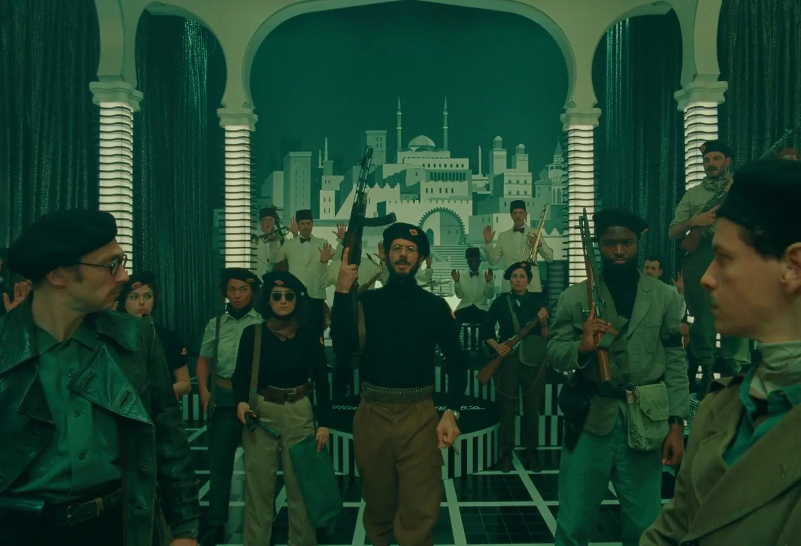
The style outlived the crew because it was never about one person's eye. It was a system anyone can study.
Building your own frame breakdowns? Start a visual reference library in StillsLab and pull the exact stills that show what you're chasing — centered, symmetrical, or otherwise.
How did you like this article?
Login to react to this article
Discussion (0)
💬 No comments yet. Be the first to share your thoughts!